4 min read
Redesigning jwchang.dev: metal, glass, and a light that follows you
A plain one-page résumé became an embossed metal plate lit by your scroll. Here's how, and how I kept it readable and at 60fps.
Before

It loaded fast and read fine. It also looked like every other engineer’s one-page résumé.
I had a brand kit sitting unused: a violet palette, a yellow accent, and a tile of “T” and “Y” motifs. One rule for the redesign: give it material and light, without making it harder to read or slower to scroll.
After

Why metal
I prototyped three surfaces behind the same content:
- Canvas felt warm, but went flat without any shine.
- Glass was pretty, but needed something behind it.
- Metal won, because it reacts to light.
So the motifs are pressed into metal, and a light moves across it as you scroll. The glass became the cards on top.
How the plate is built

Four stacked layers, all in one fixed element:
- Spun metal: three sets of rings at periods that never line up, so no visible bands.
- Embossed motifs: pre-rendered bevel tiles, one per light direction.
- Highlight: the X-shaped glint of a spun disc, plus a soft bloom.
- Film: a faint wash of brand colors with a touch of cyan, so it reads as iridescent.
Scroll drives two things:
- The light turns clockwise at a steady pace, from 11 o’clock to 5 o’clock.
- The plate leans up to 4° and turns up to 2.5°, like a shield in your hand.
My first version just slid the light left to right. It was predictable in the boring way. A fixed light on a tilting plate looks alive, and a steady rotation is predictable in the good way.
Shadows that follow the light
A bevel is a highlight on the lit edge, a shadow on the far edge, and a drop shadow behind.
- First try: one bevel baked in, lit from the top left. Halfway down the page, the light came from the right but the shadows didn’t move.
- Fix: each of the four light tiles carries its whole bevel, and the page cross-fades between them. Highlight and shadow now travel together.
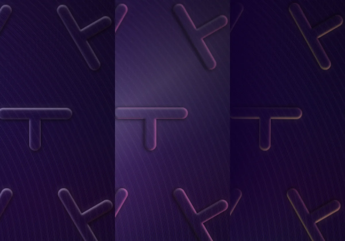
Bug worth knowing: the tile renderer treated each tile’s edge as empty space, so motifs crossing a seam got a bright line through the middle. Rendering with a margin of real pattern, then cropping, fixed it.
Glass you can read through
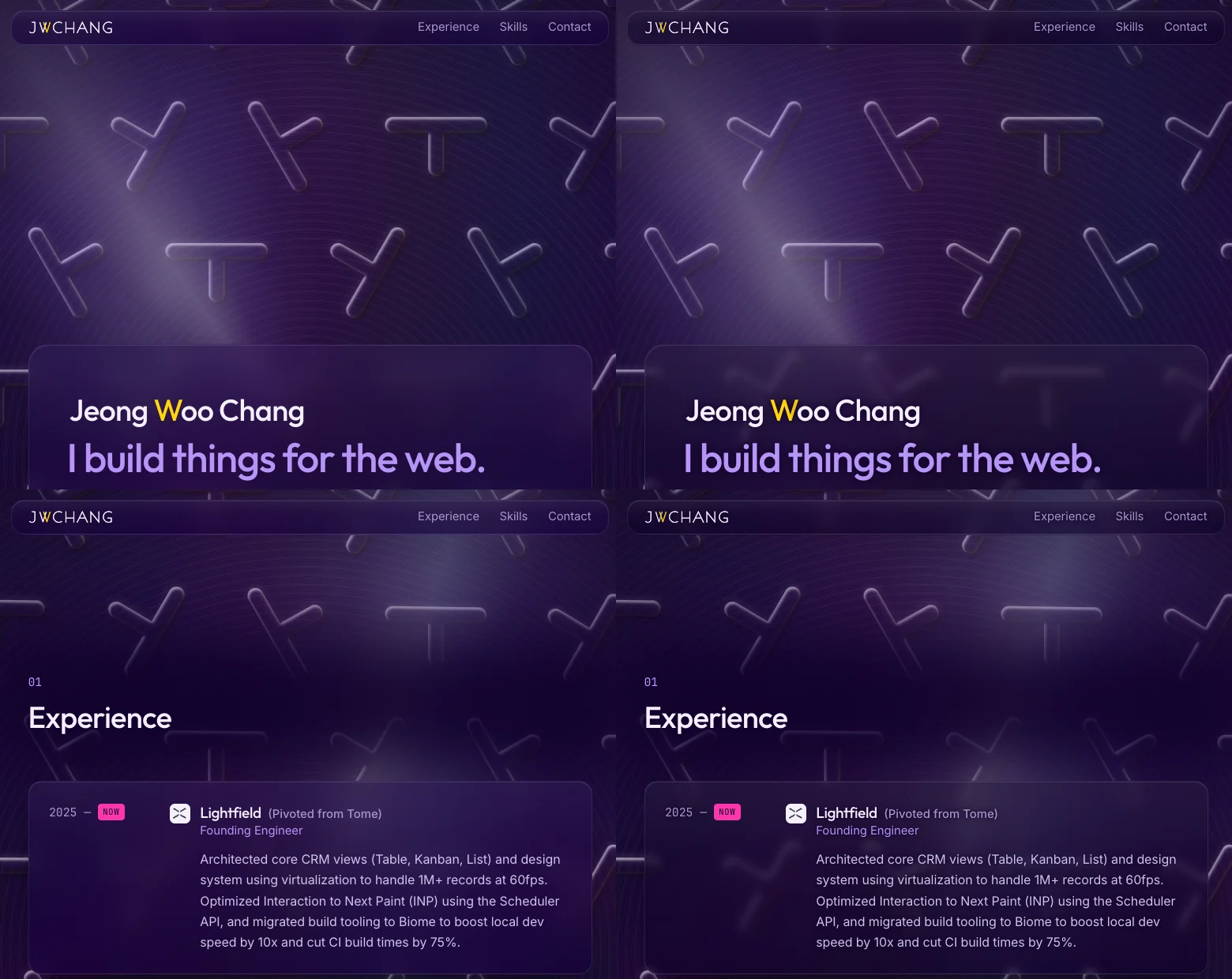
The first glass was frosted plastic: 55% tint, 16px blur. Readable, but you couldn’t see the plate.
Clearer glass meant sharp, bright rims right behind the text. What fixed it:
- Less blur (5px), lighter tint (40%) so the shapes stay recognizable.
- Dim the backdrop with
brightness()instead of adding more tint. - A tight dark halo behind each glyph, invisible on dark glass but there when a bright rim passes behind.
To check it, a script hides the text, screenshots the page, and measures every line against the brightest pixel behind it at 11 scroll positions. Every line passes 4.5:1 on desktop and mobile.
60fps
The first build stuttered badly. Three fixes:
| Problem | Fix | Result |
|---|---|---|
| Animated CSS custom properties repainted the plate every frame | Per-layer keyframes on transform and opacity only |
Frames 83ms → 16.7ms, paints 160 → 5 |
mix-blend-mode on light layers |
Plain alpha, color baked in | Render passes per frame 11.8 → 2.9 |
| SVG filters re-ran when the tilt started | Pre-rendered PNG tiles (under 45KB each) | 50ms first-frame hitch gone |
Scrolling now holds a steady 60fps with no long frames in my traces. My test setup ran at 60Hz, so I haven’t measured a 120Hz screen yet.
The logo is a font
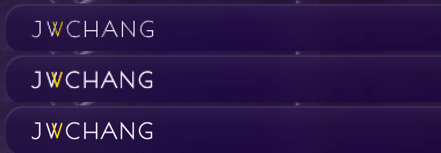
At 16px, the wordmark’s hairlines broke up as an image. Hand-hinting a separate SVG per screen density helped a little.
What worked: turning the logo into a font, built from its own outlines, under 1KB. Browsers render text with a rasterizer tuned for thin strokes, and on macOS font smoothing keeps them solid.
Small typography fixes
- Tagline first: “I build things for the web.” is the biggest line; the name sits above at 75% of its size.
- Spacing in
em: half a line between name and tagline, almost a full line before the paragraph. - Optical alignment: the “J” is read by its stem, which sits right of its hook. Hanging it 0.2em into the margin lines it up with the lines below.

- Headings align with card text, not the cards’ faint edges.
- Logo tiles are sized by eye, since a solid yellow square looks far bigger than a thin line drawing.
On a phone

Same plate with smaller tiles, a native popover menu, and type that scales fluidly instead of jumping at breakpoints.
Next
This blog is written in MDX, so future posts can embed live demos. The plate is a good candidate.